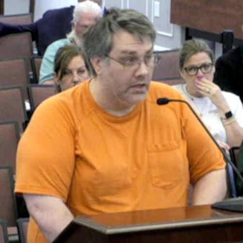
On May 20, 2025, I returned to the Board of Supervisors to finish the words that emotion and a ticking clock had cut short two weeks prior. My goal was to leave the Board with a vision of what Warren County looks like when we value pride over the bottom line.
The Beacon in the Storm
I picked up exactly where I left off: the architecture of Samuels Public Library. Its design as a lighthouse is a physical manifestation of its mission. It is a beacon—a place of safety and a guide for curiosity and community connection during times of uncertainty.
Drawing once more from Jeff Siegler, I warned the Board against the “Dollar General-ization” of our community. No one wants to live in a place that settled for being merely “affordable.” We should strive to be a county that is:
- Livable: Designed for the needs of its people.
- Lovable: Full of beauty and dignity that residents want to protect.
- Filled with Pride: A place where we lead for tomorrow’s children, not just today’s budget.
A Note on Professionalism: “Petty” but Important
After concluding my call to service, I couldn’t help but point out a detail that spoke to the very lack of “civic pride” I was discussing. In the county’s formal plans, the use of slanted, jagged, and curly fonts felt out of place and unprofessional.
It might seem like a small, petty critique, but as a business owner and someone who values design, I know that the “silliness” of a font can undermine the seriousness of a message. If we want a county that is easy to love and respect, we must present ourselves with the professional polish that our residents deserve.
Moving Forward
With the “Hard to Love” speech finally complete, my hope is that the Board begins to see the library—and all our public spaces—not just as expenses to be managed, but as assets to be cherished.
Watch the Conclusion
You can view the final half of my speech and my comments on the plan’s typography here:
- 0:00 – The Lighthouse Symbolism & Seeking a “Lovable” County
- 1:02 – Critiquing the Unprofessional Font Choices in the Official Plan
Transcript (auto-generated)
Chapter 1: Hard to Love
0:00Good evening, supervisors. My name is Louie Motton from the North River District. I’ve also spoken about the public comment period and my disdain for
0:08
8 secondswhat what you’ve been doing. Um, but I’m here to talk about the approval of accounts tonight because it has very
0:16
16 secondsmuch everything I tried to talk about last time. So, I’d like to pick up where I left off two weeks ago.
0:24
24 secondsThe library is one of those places. and its design shaped to resemble a lighthouse is no accident.
0:31
31 secondsIt was built that way to symbolize what it has always been, a beacon, a place of light in times of uncertainty, a place
0:38
38 secondsof safety, and a guide for learning, curiosity, and community connection.
0:44
44 secondsSigler warned us not to become the dollar generals of town towns. He wrote, “No one wants to live in a place like that. We shouldn’t settle for being a
0:53
53 secondscounty that’s merely affordable. We should strive to be a county that’s livable, lovable, and filled with pride.
1:01
1 minute, 1 secondSo, I ask you, not as a trustee, but as a resident, business owner, and someone moved to serve. Please lead in a way that values what this place can be, not
Chapter 2: Unprofessional Plan
1:10
1 minute, 10 secondsjust for today’s budget, but for tomorrow’s children. Let’s be a county that’s easy to love.
1:16
1 minute, 16 secondsThank you. Lewis Motton of North River District. My only comment is the fonts.
1:23
1 minute, 23 secondsIt’s It’s petty, but you know, get do something about the fonts. It’s the the silliness of the font is just very weird. Thank you.
1:33
1 minute, 33 secondsThe the the the slanted jaggedness curly fonts in the in the plan. That’s it. Oh, okay.